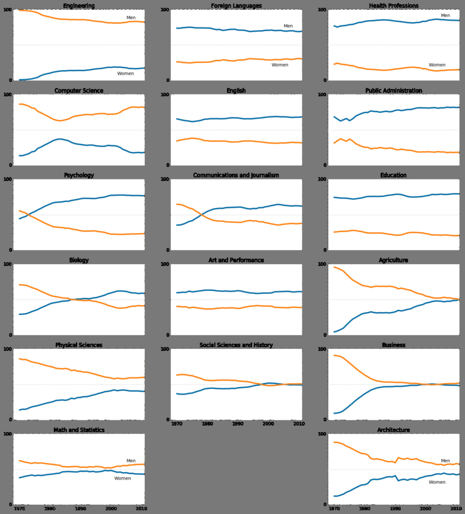
In this post, I’ll show a visualization that I’ve created using Python for the gender gap across college degrees between 1970 and 2012 in the USA. The dataset used contains the percentage of bachelor’s degrees granted to women for that period, and is made available, publicly, by The Department of Education Statistics.
While the visualization might be useful for you to understand the gap, my goal from this post is to show you how that can be done in Python. I’ve used pandas and matplotlib modules to complete this exercise.
I’ve done some customization on colors, line widths, layout, and annotations to improve the ability for a viewer to extract insights from the chart. Moreover, I’ve used colors which are mindful for color blindness people.
The most common form of color blindness is red-green color blindness, where the person can’t distinguish between red and green shades. Approximately 8% of men and 0.5% of women of Northern European descent suffer from red-green color blindness.
Here is the final visualization for the gender gap in college degrees in the USA for the period between 1970-2012 for 17 majors:
To make this more practical and realistic, I’ve edited my code in a Jupyter notebook and uploaded it into my github repository. You’ll be able to download the dataset from there as well, if you wish to practice it.
Click here to jump into the notebook.
NOTE: github won’t display pretty page output if you’re on mobile. Please use either tablet/computer, or request “desktop” version on your mobile device.